Free palette finder · TrueColors: Color Analysis
The 12 seasons color palettes
The 12 seasons split Spring, Summer, Autumn and Winter by their strongest quality: light, true, bright, soft or deep. Below is every season's palette exactly as the TrueColors app uses it: core colors with hex codes, clothing colors, best neutrals and metals, hair colors and the colors to avoid. Type any hex code to find its nearest palette colors.
Paste a hex code from a product page or a color picker. The finder lists the nearest colors across the 12 palettes, measured the way the app measures them. Nothing you enter leaves your browser.
#C17B58 is Muted Terracotta, a Soft Autumn core color. Turn on JavaScript to look up your own.
A nearest-color list, not a verdict: the app's clothes check also weighs warmth, lightness and clarity against your season and gives a 0–100 score.
Which are the 12 color seasons?
Seasonal color analysis sorts people by three qualities of their natural coloring: undertone (warm or cool), depth (light or deep) and clarity (clear or soft). Springs and Autumns are warm, Summers and Winters cool. Each family then splits three ways by whichever quality stands out most, which gives twelve seasons. Not sure where you start? Take the eight-question self-check.
Spring
Light Spring
Light, warm & delicate
Peach, Light Coral, Buttercream, Soft Turquoise, Warm Pink
True Spring
Warm, clear & fresh
Coral, Golden Yellow, Grass Green, Turquoise, Tomato Red
Bright Spring
Warm & vivid
Hot Coral, Electric Turquoise, Bright Golden Yellow, Poppy Red, Warm Fuchsia
Summer
Light Summer
Light, cool & soft
Powder Blue, Soft Lavender, Dusty Rose, Soft Mint, Periwinkle
True Summer
Cool & muted
Slate Blue, Mauve, Soft Teal, Dusty Pink, Soft Plum
Soft Summer
Cool, soft & gentle
Dusty Lavender, Soft Sage, Muted Rose, Grayed Blue, Smoky Teal
Autumn
Soft Autumn
Warm, soft & earthy
Olive, Muted Terracotta, Soft Camel, Dusty Teal, Sage Green
True Autumn
Warm & rich
Rust, Pumpkin, Olive Green, Mustard, Teal
Deep Autumn
Deep, warm & grounded
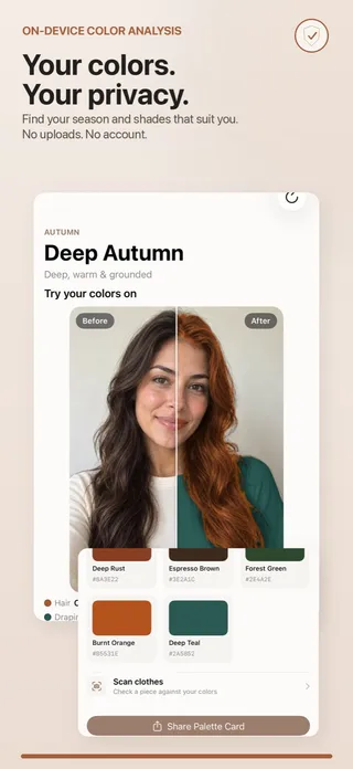
Deep Rust, Espresso Brown, Forest Green, Burnt Orange, Deep Teal
Winter
Deep Winter
Deep, cool & dramatic
Deep Burgundy, Emerald, True Red, Navy, Deep Purple
True Winter
Cool & clear
True Red, Royal Blue, Emerald, Fuchsia, Icy Pink
Bright Winter
Cool & vivid
Hot Pink, Electric Blue, True Red, Emerald, Bright Purple
How should I use a season palette?
Wear the core and clothing colors closest to your face: tops, scarves, collars, glasses frames. Build the bulk of a wardrobe on the best neutrals, which do the quiet work in coats, trousers and bags, and let one palette color lead each outfit. Metals tell you whether gold, silver, rose gold or bronze sits better against your skin. The hair colors are the shades the app suggests and previews for that season. The colors to avoid are the ones that work against that season's coloring near the face; they are still fine further from it.
Every hex code below comes from the app's own palette tables, unchanged, so what you see here is what TrueColors shows in a result, drapes on your photo and compares with a garment in the clothes check. Swatches on a screen are approximations: compare them in daylight, and trust the name and the hex code when you shop online.
What colors suit a Light Spring?
Spring · Light, warm & delicate
TrueColors describes Light Spring like this:
Your coloring is warm and delicate, with a gentle glow that light, clear colors bring out beautifully. Soft peaches, warm corals, and light golden tones echo your natural warmth without overwhelming it.
- Lead with soft, warm pastels rather than stark white or black.
- Choose light gold or rose-gold jewelry over silver.
- Keep makeup sheer and warm — peachy blush over deep, cool shades.
| Core colors |
|
|---|---|
| More clothing colors |
|
| Best neutrals |
|
| Metals |
|
| Hair colors |
|
| Colors to avoid |
|
What colors suit a True Spring?
Spring · Warm, clear & fresh
TrueColors describes True Spring like this:
You carry a warm, clear undertone that lights up next to fresh, saturated color. Golden yellows, coral, and grass green look vivid on you because they share the same warmth as your skin and hair.
- Build outfits around one clear, warm color rather than muted neutrals.
- Gold jewelry will read better on you than silver.
- A coral or warm-red lip is an easy, reliable flattering choice.
| Core colors |
|
|---|---|
| More clothing colors |
|
| Best neutrals |
|
| Metals |
|
| Hair colors |
|
| Colors to avoid |
|
What colors suit a Bright Spring?
Spring · Warm & vivid
TrueColors describes Bright Spring like this:
Your coloring has real sparkle — warm and vivid at once — so bold, saturated colors are where you come alive. Muted or dusty tones tend to flatten that natural brightness.
- Don't be afraid of saturated color — it's your strongest tool.
- Pair one vivid piece with a warm, simple neutral so the color leads.
- Bright gold jewelry and a clear red or coral lip both work well.
| Core colors |
|
|---|---|
| More clothing colors |
|
| Best neutrals |
|
| Metals |
|
| Hair colors |
|
| Colors to avoid |
|
What colors suit a Light Summer?
Summer · Light, cool & soft
TrueColors describes Light Summer like this:
You have a cool, soft, light coloring that responds best to gentle, hazy colors. Powder blue, soft lavender, and dusty rose all share your cool undertone and light touch.
- Soft, cool pastels will do more for you than bold, saturated colors.
- Silver and soft rose-gold both flatter; warm yellow-gold can clash.
- Cool-toned pink or rose lip colors are more flattering than orange-based ones.
| Core colors |
|
|---|---|
| More clothing colors |
|
| Best neutrals |
|
| Metals |
|
| Hair colors |
|
| Colors to avoid |
|
What colors suit a True Summer?
Summer · Cool & muted
TrueColors describes True Summer like this:
Your undertone is cool and your coloring sits in a soft, medium range — colors with a touch of gray woven in, like slate blue or soft teal, feel like a natural extension of you rather than competing with you.
- Reach for colors with a touch of gray rather than pure, saturated hues.
- Silver jewelry suits you better than gold.
- A mauve or rose lip works harder for you than a bright red.
| Core colors |
|
|---|---|
| More clothing colors |
|
| Best neutrals |
|
| Metals |
|
| Hair colors |
|
| Colors to avoid |
|
What colors suit a Soft Summer?
Summer · Cool, soft & gentle
TrueColors describes Soft Summer like this:
Your coloring is cool with a gentle, muted quality — the softest of all twelve seasons. Gray-toned colors like dusty lavender and smoky teal flatter you more than anything saturated or stark.
- Muted, gray-toned color is your sweet spot — avoid anything too bright or too stark.
- Brushed or matte silver beats shiny gold.
- Soft, blended makeup in dusty tones looks more natural than high-contrast looks.
| Core colors |
|
|---|---|
| More clothing colors |
|
| Best neutrals |
|
| Metals |
|
| Hair colors |
|
| Colors to avoid |
|
What colors suit a Soft Autumn?
Autumn · Warm, soft & earthy
TrueColors describes Soft Autumn like this:
You're warm-toned with a soft, earthy quality. Muted, golden colors — olive, soft camel, dusty teal — feel grounded and natural against your coloring, while anything icy or neon tends to fight it.
- Earthy, muted color — olive, camel, soft terracotta — will outperform anything icy or neon.
- Brushed gold or bronze jewelry suits you better than silver.
- A soft terracotta or brick lip is an easy go-to.
| Core colors |
|
|---|---|
| More clothing colors |
|
| Best neutrals |
|
| Metals |
|
| Hair colors |
|
| Colors to avoid |
|
What colors suit a True Autumn?
Autumn · Warm & rich
TrueColors describes True Autumn like this:
Your undertone is warm and rich, and richly saturated, earthy color brings that out. Rust, pumpkin, and olive green all carry the same golden warmth you do naturally.
- Rich, warm color (rust, mustard, olive) is more flattering than anything pastel or icy.
- Bronze or antique gold jewelry will read better than silver.
- A warm brick-red or terracotta lip suits you well.
| Core colors |
|
|---|---|
| More clothing colors |
|
| Best neutrals |
|
| Metals |
|
| Hair colors |
|
| Colors to avoid |
|
What colors suit a Deep Autumn?
Autumn · Deep, warm & grounded
TrueColors describes Deep Autumn like this:
You have warm, deep coloring that can carry rich, saturated color with real presence. Deep rust, forest green, and espresso brown match both your depth and your warmth.
- Lean into depth — deep rust, forest green, and espresso all suit you better than light or pastel colors.
- Antique gold or copper jewelry complements your warmth.
- A deep brick or terracotta lip holds up against your natural depth.
| Core colors |
|
|---|---|
| More clothing colors |
|
| Best neutrals |
|
| Metals |
|
| Hair colors |
|
| Colors to avoid |
|
What colors suit a Deep Winter?
Winter · Deep, cool & dramatic
TrueColors describes Deep Winter like this:
Your coloring is cool and deep, which means strong contrast and saturated, cool color read as natural on you rather than harsh. Deep burgundy, emerald, and true red all have the depth to match.
- High contrast — dark colors against your features — looks intentional on you, not harsh.
- Silver or white gold will outshine yellow gold.
- A true red or deep berry lip is a reliable, strong choice.
| Core colors |
|
|---|---|
| More clothing colors |
|
| Best neutrals |
|
| Metals |
|
| Hair colors |
|
| Colors to avoid |
|
What colors suit a True Winter?
Winter · Cool & clear
TrueColors describes True Winter like this:
You have a cool, clear undertone, and clean, saturated colors look crisp against your coloring. True red, royal blue, and emerald all share that same clarity.
- Clean, clear, saturated color suits you better than anything muted or earthy.
- Silver jewelry is a safer bet than gold.
- A blue-based red lip is an easy way to use your natural clarity.
| Core colors |
|
|---|---|
| More clothing colors |
|
| Best neutrals |
|
| Metals |
|
| Hair colors |
|
| Colors to avoid |
|
What colors suit a Bright Winter?
Winter · Cool & vivid
TrueColors describes Bright Winter like this:
Your coloring is cool and vivid, so the most saturated colors in the spectrum are the ones that look most natural on you. Hot pink, electric blue, and emerald all match your inherent brightness.
- The most saturated version of any color you try on is usually the most flattering one.
- Silver or platinum jewelry suits you better than warm gold.
- A vivid fuchsia or blue-red lip matches your natural intensity.
| Core colors |
|
|---|---|
| More clothing colors |
|
| Best neutrals |
|
| Metals |
|
| Hair colors |
|
| Colors to avoid |
|
Sources
Questions people ask
What are the 12 seasons in color analysis?
Light Spring, True Spring and Bright Spring; Light Summer, True Summer and Soft Summer; Soft Autumn, True Autumn and Deep Autumn; Deep Winter, True Winter and Bright Winter. Each family is split by its strongest quality: light, true (pure warm or cool), bright, soft or deep.
Where do these hex codes come from?
From the TrueColors app itself: they are the swatches its palettes, try-on studios and clothes check use, copied from the app’s data without change. They are representative colors chosen for each season’s undertone, depth and clarity, not a licensed swatch book.
What are the best neutrals for my season?
Warm seasons lean on ivory, camel, warm taupe and browns; cool seasons on soft white, grays, navy and, for Winters, black and pure white. Each season’s exact neutrals are in its table above, next to the metals that suit it.
Can I wear a color from my "avoid" list?
Yes, away from your face. The avoid list is about what sits next to your skin: a trouser, a bag or shoes in an avoided color does little. Near the face, pair it with one of your neutrals or a scarf from your palette.
How do I check whether a piece of clothing fits my palette?
Type its hex code into the finder at the top of this page to see the nearest palette colors. In the TrueColors app you photograph the garment instead, and it scores how well the color suits your season, with the closest colors from your palette.